
TEXT BY 撰文 X MONICA CHUNG
TRANSLATE BY 翻譯 X AVITA GUO 郭顏
IMAGE COURTESY OF 圖片提供 X VIVIEN ZHANG 張月薇
.
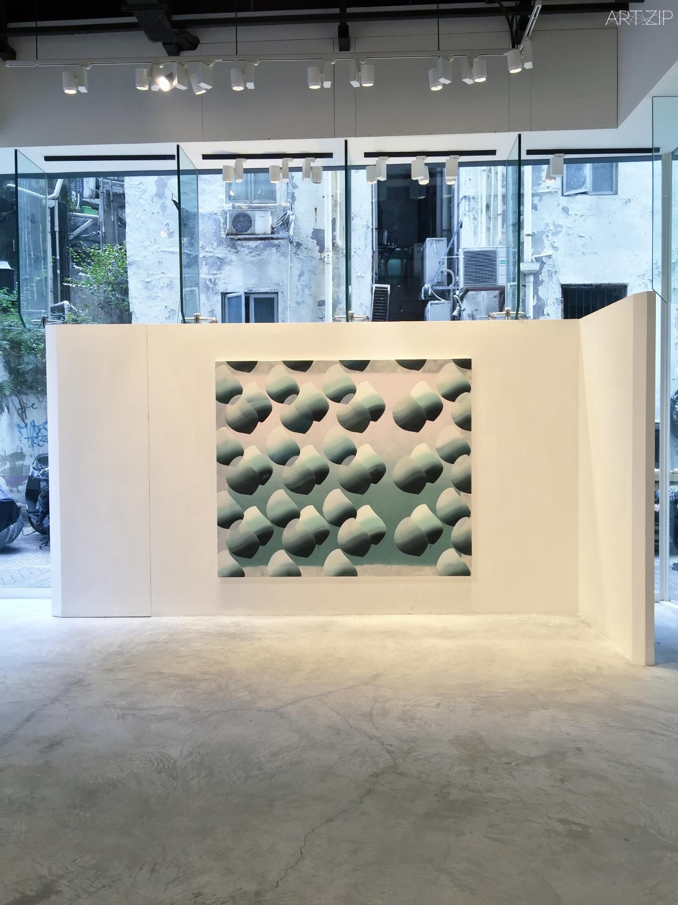
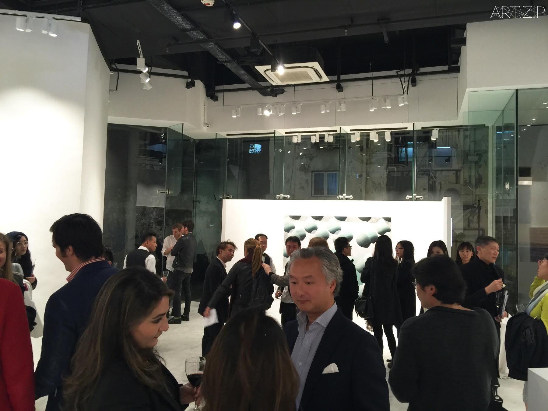
On the eve of Vivien Zhang’s debut solo exhibition at Galerie Huit, Hong Kong, ART.ZIP invites Monica Chung, curator and consultant, to interview the artist about her new paintings and art practice.
ART.ZIP雜誌有幸採訪了青年藝術家張月薇,她的個人展覽將在近期於錦藝舫(Galerie Huit)舉辦,資深藝術顧問及當代藝術策展人Monica Chung女士主持了這次的採訪,她和藝術家一起就其近期的繪畫創作和藝術歷程展開探討。
.
ART.ZIP: How would you define your work?
VZ: I’d like to think of my work as a site for the assemblage of context-specific motifs, where it no longer serves as a place for the narration or representation of an image, scene, or even idea. It’s where elements congregate, to allow new collisions and the rise of a placeless-ness.
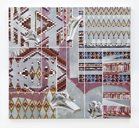
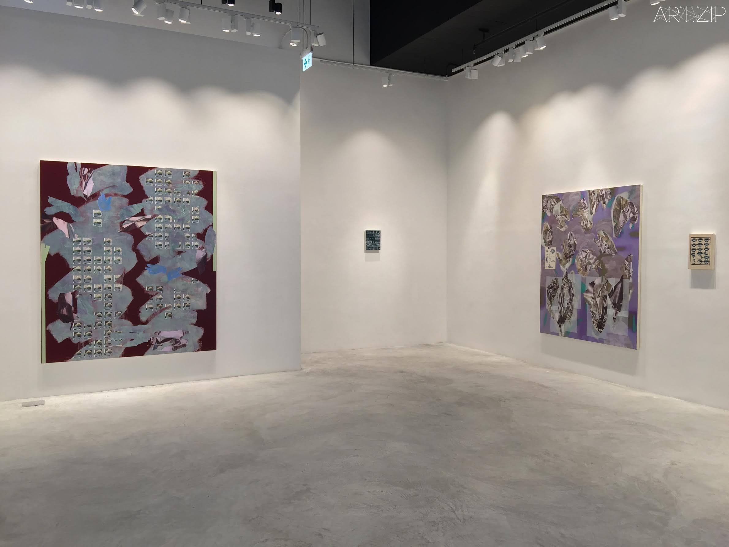
ART.ZIP: In your forthcoming exhibition, there is a painting titled ‘Double Bloom’. In it, you have incorporated your signatory painted motifs. What inspires this form of repetitive narrative?
VZ: Double Bloom came about initially as I was thinking about the idea of the “double” as a form of repetition. Repetition doesn’t only refer to the multiple; a one-time repeat or a double, is also repetition. I had done some drawings before with stickers I found at a stationary mall in China (my childhood heavens). In the drawings, the stickers were arranged in clusters, and posed a similarity to a print in The Grammar of Japanese Ornament – a book I have been looking at for some time. So adapting the composition of this particular Japanese print with the stickers, I wanted to create a work for my next show that highlights repetition in a less familiar order. These were the initial points from which I approached this painting.
Double Bloom_2015_150x112cm
ART.ZIP: Is it intentional that your motifs resemble stickers? What gesture are you making through mimicking rather than applying real stickers?
VZ: Yes, the motifs are executed in a way to resemble actual stickers. Trompe l’oeil plays a large part in my work. In Double Bloom, the stickers’ edges are accentuated to produce a volume, retaining the effect of an additional layer pasted onto something. Painting the stickers gave me the freedom to manipulate their scale and colours, so that my stickers are less of a linear translation of the real. I am more interested in the aftermath of juxtaposing different signs in my work than the ready-made. I didn’t want to confuse the conversation by using stickers directly. Another motif I used in Double Bloom was the gömböc, which can be seen in some other works of mine. The gömböc here situates in the background of the painting, and are enlarged extensively that the duo spill out of the canvas.
I re-employ motifs across different works. In each work I like to think of them as having transformed, metamorphosed, or a subsidiary characteristic of the motif is highlighted instead of its exact original self – it could be the negative space of the motif, or imagining a folded version of it in print. Particularly because of today’s climate – where inspections on the artist’s persona and status are evermore prevalent when looking at a work of art – I want to ask, through deliberate control of how accessible the motifs and images are in my work: how does it affect the audience’s speculations on my work; how does the distance between the audience, my work, and myself change, when the exercise of revealing and taking away components of recognisable motifs and images is visible?
ART.ZIP: Other familiar icons in your work are the shapes and forms that float like fragments across the canvas. Do you view them as such?
VZ: I am very interested in fragmentation and fragility, initially as I was thinking about emotional instability and later on, in thinking about the increase in speeds and temporal gaps in our daily experiences, and also how the digital has contributed to forming fragmentary shifts and distractions in our experiences too.
Deeper Bite_2015_mixed media on canvas_210x180cm
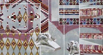
ART.ZIP: With one of your paintings, ‘Surf: String Theory’, what does the title refer to? Is the familiar kilim pattern suggesting that the piece is influenced by impressions on your childhood spent in Asia then Africa.
VZ: Surf: String Theory is the first of a series of works all based on kilims. The first part of the title, “surf”, references the title of a recent show – “Surf the Anodyne”. The word refers to making work in a way by “riding” on a specified process. When I was titling this small painting, I had known I wanted to make this into a series, with variations in the kilim pattern – this is a reflection of how kilim production is heavily based on their tradition and heritage, and also of my own interrogation in having a specified or formulaic working process in an artistic practice.
Kilims have always been in my childhood surroundings. Even now in my parents’ modern Hong Kong apartment, African furniture and Iranian kilims dominate the ambience. I moved to Nairobi, Kenya, with my mother at the age of ten, and four years later when we left, my mother traded her Ikea and Chinese furniture for African ones. They’ve been with us since and for a long time I took all those objects for granted.
“String theory”, the second part of the title, refers to my interest in gravity. Increasingly, I feel a shift in physical weight in my paintings, probably as a result of looking a lot at the collages of Hannah Höch. A sense of cut-and-paste has become more prominent perhaps, where everything is floating and the relationships in my paintings are front-and-back, rather than foreground-and-background, which denotes gravitational weight and is associated with real space and landscapes.
Surf, String Theory_2015_51x56cm
ART.ZIP: How do you arrive at your palette where there is a tension between bright and bold colours and the subdued tones and shadows?
VZ: It may be more about avoiding very straightforward combinations, such as direct complementary colours. I can use Order, Oscillation, and Pretence Gesture (Shape Green) (2013) as an example. In this work, the most important element is the shapes, which are devised by Swiss artist Johannes Itten. Itten allocated shapes to represent specific colours, and the shape in this painting represents the colour green. The shapes became placeholders in order for me to deal with red – a very strong colour I usually find difficult to work with.
ART.ZIP: Is it a conscious step to shift the palette in your new paintings towards grey and neutral tones?
VZ: Retracing my steps, I think what happened was I didn’t wanted to start a painting with a solid pastel colour anymore. That dominated my works up to 2014. Instead, I wanted to trace washes of strokes – something I observed when sanding the ground of my paintings with water and waterproof sandpaper. During the same period I started using chameleon flip paint, which changes colour from different angles, and also metallic paint as I became interested in the aluminium foil as a motif in my work. Metallic paint and aluminium foil are both metals, and the foil in particular started playing a big role in my work. In relation to fragility, the foil comes from such a robust material, yet it is extremely malleable and when it is crumpled it’s broken, but it can still exist as one entity. I’m very attracted to the dichotomy in these materials.
ART.ZIP: In your childhood, you moved from Beijing to Nairobi then to Bangkok. Do you think travelling between such diverse cultures has influenced your work? Would you view your motifs as stamps on an envelope? What’s your notion of identity?
VZ: Having lived in all these places has definitely influenced me, and my work. To start with I revisited a lot of Chinese cultural artefacts through my work, in an attempt to re-claim my native culture and heritage I felt increasingly distant from. Though, quickly, I began to realise not only did it prose a lot of problems to only use Chinese motifs in my work (because of my look and also being a “Chinese artist” by nationality), it also wasn’t a comprehensive reflection of my experience and actual identity.
So then I started to look at objects that have been in my surroundings growing up, like African sculptures and instruments in my parents’ house. This introduced new geographies in my work and is more considerate of where I come from and where I am. At the same time, I also think having an “identity” often means you’re bound because of the need to identify with certain conventions, characteristics and assumptions. The proposition I want to make with my work, though, is to lose discreet and closed associations with specific places, definitions and badges because of the direction we’re moving in – evermore fluid, volatile, transient, and also with more intersections and congruencies.
ART.ZIP: Having now settled in London, would you say that your paintings are creating some sort of visual identity for you and of you?
VZ: I receive comments telling me so more than I am consciously trying to cultivate one. There are definitely habits and considered processes of working. Between observing the accelerations around us and being a painter (painters are known to constantly ask themselves “what to paint next?”), I started setting up a self-referential way of working, where elements from one work would feed into the next. I mentioned this previously on reiterating motifs. So I think inevitably shifts and moves I make translate in my work, they leave a trace. However, if such an identity forms it would be natural and unstudied. I’m much more concerned with how to take a leap, what to interrupt, break and disobey in my work, than manifesting a specific character.
ART.ZIP:你是如何解讀你自己作品的?
VZ:我把我的作品解讀成一系列特屬環境下視覺符號的聚集地。在這裡,作品不再陳述或表達一個具體的圖像、場景甚或概念。不同的元素聚集在我的作品中,它們之間產生新的沖撞,生成一種無境之地。
ART.ZIP:在你即將舉辦的展覽上,有一幅畫的名字叫做《雙重綻放(Double Bloom)》。這幅畫呈現了你經典的符號重復。你這種重復性的形式靈感來自何處?
VZ:《雙重綻放》的創作始源於我對“雙重”代表“重復”這一概念的思考。重復性並不單單涉及到“多重”;一次性的反復或“雙重”也是重復。我曾在國內的一個文具商場中——我童年的天堂——找到一些貼紙,用它們做過一系列紙本繪畫。在那些畫作中,我把貼紙有序地組成一簇一簇,模仿呼應《日本裝飾法則(The Grammar of Japanese Ornament)》中的一幅版畫。這本書我已經翻閱了不少日子,我希望在這幅用貼紙重構的日本版畫基礎上,為接下來的展覽創作一個作品,以非常態的呈現方式來強調“重復”這個概念。這就是著手這幅作品的最初想法。
ART.ZIP:你的符號摹仿貼紙,這是有用意的嗎?摹仿而不是直接使用貼紙的做法又是表示什麽呢?
VZ:是的,我的確在摹仿貼紙。錯視畫法(trompe l’oeil)是我在創作中的一個重要元素。 在《雙重綻放》裡,我刻意強調了貼紙的邊緣,以表現三維質感,創造層次疊加的效果。用畫筆繪制這些貼紙,可以讓我自由隨意地處理比例和顏色,而貼紙的切入也不再僅是一個實物的簡單直線轉化。我對不同符號並置下的結局比“現成物”更感興趣。我不想因使用真實的貼紙而影響作品引出的對話。另一個用在這幅畫中的視覺符號是岡布茨(gömböc)——它也出現在我的其他作品中。在畫作中,岡布茨處於畫面背景,雙雙被擴大延伸,突破畫布外溢出去。
在創作中我會重復使用一些視覺符號。我讓它們在每幅作品裡經歷轉化、蛻變,或者符號的某一附屬特質得以突出,而不是和盤端出。這裡指的“附屬特質”包括符號的負空間,或對符號被折疊的想象。當下的思潮是在觀看藝術作品時越來越特別審視藝術家的個體特點和狀態。我想借助刻意控制對作品中符號和圖像的理解維度,提出這樣的問題:這種掌控如何影響觀眾對我作品的思索?當創作中對符號的揭示和刻意移除可讓人察覺時,觀眾、我的作品、與我自己之間又產生了什麽樣的距離變化?
ART.ZIP:那麽在其他畫作中,有些形狀如同碎片一樣在畫布上四散漂移。你也是這樣的解讀嗎?
VZ:我對破碎和脆弱性很感興趣。這一開始來自於我對情緒變化的探索,而後來我開始思考我們日常經歷中日益加快的速度與時間的斷裂,以及數字時代給生活造成的零散、分裂、三心二意的狀態。
ART.ZIP:你另外一幅作品 《沖浪:弦理論(Surf:String Theory)》,這個題目有何所指?那熟悉的基裏姆地毯圖案是否受到你兒時在亞洲和非洲生活記憶的影響?
VZ:《沖浪:弦理論》是一系列以基利姆(Kilim)地毯圖案為主題的第一張作品。畫作名稱的第一部分:“沖浪”,參考了我近期一個展覽的標題——《沖駕那乏善可陳(Surf the Anodyne)》。這個詞指創作作品時“騎乘”著一個特定的程序。當我在給這幅小畫取名時,我已經知道我想圍繞基裏姆地毯做一系列創作。基裏姆地毯本身的生產嚴守傳統和文化的傳承,而我自己也在探索藝術家的創作過程是否應該遵循特定的或者公式化的規程。
我的童年其實一直有基裏姆地毯伴隨。今天在我父母香港的現代居室中,非洲家具和伊朗基裏姆地毯也是主導家中氛圍的首要因素。我十歲時跟隨媽媽到了肯尼亞首都內羅畢(Nairobi),在那裡定居四年後,媽媽把家裡的宜家和中式家具都換成了非洲物件,一直跟隨我們至今,但也因此我很長一段時間把它們視為當然。
“弦理論”,即畫作名稱的第二部分,源於我對“重力”的興趣。我越來越能感覺到自己畫作中一種重力的改變,這大概是我看了太多漢娜·霍克(Hannah Höch)拼貼畫的結果。一種剪貼的意識更加突出,一切都漂浮不定,作品表現的關係是前與後的關係,而不是前景——背景,不再著力表現引力帶來的重量及其與真實空間和景觀的關係。
ART.ZIP:你是怎麽在調色方面如此有神來之道?比如那種明亮、大膽的顏色與柔和色調和陰影之間的拉張對比?
VZ:我覺得可能就是避開那些特別直接的組合吧,比如說直接的互補色。我可以用《秩序,波動,以及矯勢(綠型)(Order, Oscillation, and Pretence Gesture (Shape Green))》這幅2013年的作品舉個例子。這幅作品中最重要的元素是裡面的圖形。圖形的原創者是瑞士藝術家約翰斯·伊頓(Johannes Itten)。 他將不同的圖形劃分給不同的顏色,而我作品中的圖形象征著綠色。它們在作品中成為了一種占位符號,輔助我去有序地使用紅色——紅色是我認為較難駕馭的強烈顏色。
ART.ZIP:所以說在你新作中的灰色和中性調子是有意識的轉變嗎?
VZ:如果回顧一下,我想我當時只是不想再用清淡柔和的顏色起稿了。直到2014年,我一直以那種色調著手。我現在想追求的是一種流動的筆觸——我在用水和砂紙打磨畫布底料時觀察到了這種擦痕。與此同時,我發現了一種變色噴漆,這種顏料從不同的角度會展現出不同的顏色,還有金屬色顏料,因為我開始對鋁箔產生了濃厚的興趣。金屬色顏料和鋁箔都有金屬質感,而鋁箔更是漸漸成為我作品中的主要題材。相對脆弱這一概念而言,鋁箔既有堅硬的質感,同時又具備極強的韌性,被弄皺時依然能夠作為一個完整的個體繼續存在。吸引我的正是這種二元對立性。
ART.ZIP:你童年時從北京搬到了內羅畢,然後又搬到了曼谷。你覺得這種極度的多元文化有沒有影響你的作品?你有沒有覺得你作品中的圖案就好像是信封上的郵戳?你怎麽定義個人身份的概念?
VZ:我在這些地方的生活經歷肯定對我和我的作品是有影響的。首先,我通過作品,重訪了許多中國文化物品,試圖回歸我感到日益疏遠的本土文化和歷史傳承。但我馬上也意識到只用中國元素引出的許多問題(因為我的外表和國籍而被冠以的 “中國藝術家”身份),而且這也不是我真實個人身份和經歷的全面寫照。
於是我開始關註我成長過程中周圍環境裡的物體,比如說我父母家的非洲雕塑和樂器。我的作品也因此開始出現新的地域,而且更緊密地追隨著我曾經和當下的所在。但同時,我也覺得擁有一個“身份”往往伴隨著束縛,因為身份就意味著必須認同一定的成規、特征和既成的觀點。然而我更想用作品來表達的命題是脫離,也就是從與某地、某些定義和標簽的牽扯以及局促的關係中脫離出來,因為這正是我們當下移動的方向——一切都在流動中,易變、短暫,越來越多軌跡的交叉、離合。
ART.ZIP:你現在已定居倫敦,能不能說你的畫作就是在為你自己創造一種自我的視覺身份?
VZ:我聽到很多評論,其中的解讀其實遠遠超出了我有意識想要創造的東西。當然,習慣動作和經過籌謀的工作程序是一定存在的。我一邊體察著生活中的各種加速度,一邊做我的畫家(畫家的確一直是在自省“我下一步畫什麽?”),並在這個過程中開始發展出一種自我參照的創作方式,即用一幅作品中的元素引導出下一幅的創作。我已經在談到圖案的重復時提到這一點。所以,我作品中的承轉離動,必然留下可循的痕跡。如果這構成一種身份的話,那麽就是自然而不造作的。其實我更關心的是如何在作品中實現跨越、顛覆什麽、打破什麽、違背什麽,而不是宣示一個特定的身份。
.
Tips 小貼士:
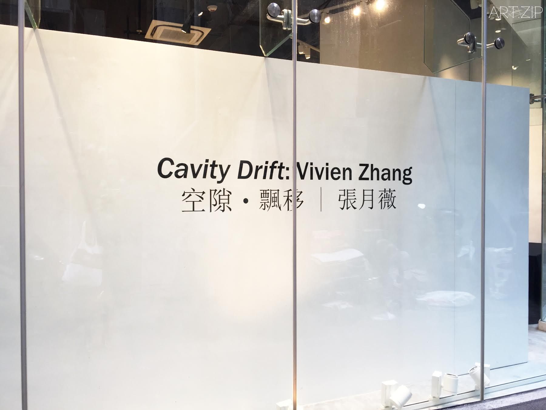
Vivien Zhang:Cavity Drift
張月薇《空隙·漂移》
15 January – 25 February 2016
Galerie Huit, Hong Kong 香港錦藝舫
More info: www.galeriehuit.com.hk